
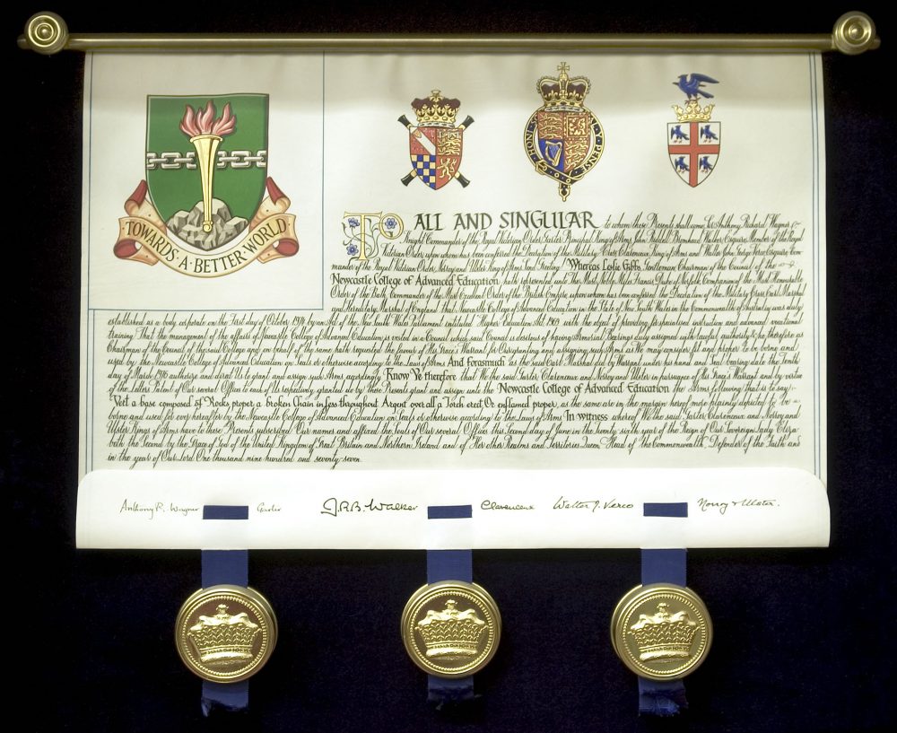
 Letters Patent for a grant of arms with the seals of the three Kings of Arms
This article falls into two sections, the first is a brief historical look at the artists of the College of Arms, who are known as Herald Painters, and the second is about their working methods, the materials they use and their approach to technical and design problems. Since the College was incorporated by King Richard III in 1484 the content of coats of arms has been decided by Officers of Arms in consultation with their clients, but their style and interpretation has always been the province of the herald painters.
Although individual artists have their own mannerisms there is an unifying style which is instantly recognisable, whether it be on a seal design for a bishop in Kenya, a stone-carving on a police station at Kingston-upon-Thames or stained glass at a church in Hampshire. This influence has not always been positive, however, because many craftsmen are intimidated by heraldry, afraid of the mysteries which only the initiated can understand and when they are commissioned to produce their own version of a coat of arms they cling nervously to the ‘official’ College painting, unwilling to depart from it by so much as a whisker. This has often led to rather static and unimaginative heraldry.
We know little about the early artists who worked there but much of their work survives in rolls of arms, on pedigrees and on letters patent, or grants of arms, which are often beautiful and vigorous works of art, the arms rich with gold and silver leaf and the borders of the text decorated with royal badges and formalised plants and flowers, carnations, wild strawberries, pansies or marigolds. The influence of contemporary herbals is very evident. A figure of the granting king of arms often appears in the letter ‘T’ which begins the text.
There are several outstanding works dating from this period, notably Prince Arthur’s Book, the Great Tournament Roll of 1510-11 and the Parliament Roll of 1511/12, all of which were probably prepared in the studio of Sir Thomas Wriothesley, Garter King of Arms. They are all similar in style and display great skill in drawing and imaginative decoration.
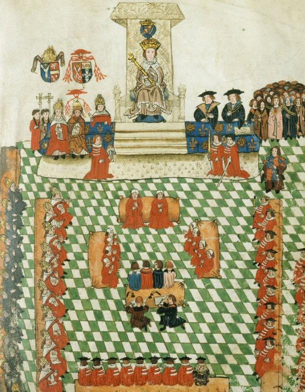 Wriothesley's Garter Book
More splendid Tudor work is found in the series of eighteen volumes of the Funeral Certificates which record the ceremonial funerals of the sixteenth and seventeenth centuries although there are a few later entries of State Funerals such as those of William (Pitt), Earl of Chatham, Nelson, Gladstone and Lord Alanbrooke. They depict the painted banners, pennons, escutcheons of arms and crests, which were carved in wood or modelled in leather and gesso, of the deceased which were carried in the funeral procession and later hung over the tomb. The preparation of these artifacts was a valuable source of income to the herald painters. However, not all the artists involved were tied to the College and its failure to control unlicensed practitioners made a fatal breach in the control of arms. The Painter Stainers’ Company of London also claimed the right to provide these decorations and a dispute between the two broke out and rumbled on for many decades. Order was briefly established in 1621 by William Camden, Clarenceux, the great antiquary, whose father was a Painter Stainer.
He secured an agreement that eight Painter Stainers should be seconded to the College but these arrangements broke down because neither body could control their members, despite prosecutions of errant painters in the Court of Chivalry. It was also during this period that the Visitations were begun when the kings of arms or their deputies travelled to every part of England and Wales to survey and record the bearings and pedigrees of those using arms and correct irregularities. They were often accompanied by their herald painters and there is an amusing incident recorded of a visit by Sir Edward Bysshe, Clarenceux, and his artist, Wither, to Banbury in 1668 when nobody appeared at the appointed venue because they had all gone to the races.
The herald painters of this period are shadowy figures although we sometimes catch a glimpse of individuals such as Richard Scarlett, (died 1607) who worked on the funeral certificates and is the first one who we can positively identify, or John Knight, of Winwick, Herald Painter to Charles I, who was a relative of Edmund Knight, Chester Herald. Sylvanus Morgan (1620-93) was also an author and wrote The Sphere of Gentry. Others come to life in the series of Painters’ Work Books in the College collections. These begin in 1619 and continue intermittently until about 1824. They are working notebooks containing rough notes of art work commissioned, much of it relating to funerals, with tricks of arms and details of decorative scrollwork, the anatomy of beasts and fishes, and entries of a diary nature, for instance in 1619, ‘Sir Thomas Holcroft brake his Neck in the Strand’. They also contain accounts, with details of income from commissions and expenditure on materials, such as the silk, gold and silver thread for funeral decorations, much as we keep our accounts to this day. Some were compiled by herald painters at the College while others were produced by artists working outside and were later added to the College collections by purchase.
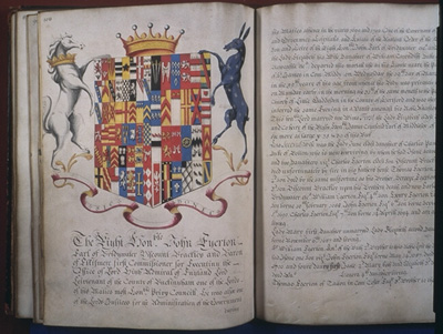 A funeral certificate
At this time the term ‘Herald Painter’ was loosely used. It could refer to a coach-painter as well as an artist working at the College and probably the relationship between the College and its artists was somewhat flexible. Some of the heralds of this period were also gifted artists. Edward Norgate, Windsor Herald, was a skilled calligrapher, art expert and illuminator and was the author of Miniatura, or the Art of Limning, written between 1621-6. A fine example of his work is the letters patent appointing the Earl of Stirling Commander-in-Chief of Nova Scotia which is now at Audley End in Essex. When Gregory King was appointed Rouge Dragon Pursuivant in 1677 he found the fees and profits were so low that he had to continue with his engrossing and herald painting until he was rescued by Sir Henry St. George, Garter, who put work his way.
The tradition of the artistic herald was continued by John Charles Brooke, Somerset Herald (1778-94) who was an accomplished heraldic artist and in the nineteenth century by Sir George Nayler, Norroy, a skilled miniaturist who is said to have worked on the famous ‘Bath Book’ which is still preserved at the college. At the beginning of the eighteenth century the College went through a period of decline, caused mainly by changing tastes and social attitudes. Heraldic funerals almost ceased and between December 1704 and December 1706 not a single grant of arms was registered. The level of art work produced must have been small and it is unlikely that there were any resident herald painters at the College. Probably any work required was commissioned from artists working outside, like John Tomson, ‘Arms Painter, of Coach Sign House in Old Jewry’, whose work book shows that he was busy painting coach panels, flags for the local militia and decorating drums as well as small paintings on vellum as guides for porcelain manufacturers.
A revival followed later in the century; in 1772 Brooke wrote that ‘the business of the office is now very great and keeps increasing — and the Treasurer’s Accounts show references to payments to artists, for instance on 29th August 1771 — ‘Paintings in Sundry books at Sundry times — 18s’. although, unfortunately, no individuals are identified.
In 1764, however, an artist was appointed Mowbray Herald Extraordinary. Joseph Edmondson had been apprenticed to a barber, became a herald painter and later the Queen’s Coachpainter. He acquired a collection of pedigrees originally assembled by Sir William Segar, Garter, and his grandson, brought them up to date and published them under the title Baronagium Genealogicum. It was a great success and was the ancestor of all our subsequent peerages. Not surprisingly, it caused some professional jealousy; Stephen Martin Leake, Garter, called him ‘a low dirty mechanick who by obsequiousness had insinuated himself into the favour of the nobility’, but it did encourage the heralds to pull up their socks and they resolved to publish their own collections of pedigrees, although, in the event, little actually happened. Edmondson lived on till 1786 but never became an Officer of Arms in Ordinary.
In 1793 an intriguing individual appeared at the College. He was Ange Denis Macquin, formerly Professor of Rhetoric and Belle-Lettres at the University of Meaux in France. He fled to England at the time of the Revolution and for a time supported himself by sketching local scenery until an introduction to Edmund Lodge, Lancaster Herald, led to his appointment as a herald painter at the College. Obviously a versatile artist, he designed Nelson’s bronze funeral chariot and a throne for the House of Lords, wrote on heraldic and kindred subjects and in 1794 was elected an honorary Fellow of the Society of Antiquaries. He died in 1823.
Heraldic art at this period reached its nadir. The importance of technical finish was encouraged at the expense of stronger qualities. Proportions were poor, mantlings were graceful but often too small, helmets were physically impossible and crests perched on wreaths like straight poles that bore no resemblance to the silk cord that encircled the medieval helmet. Shields were square and their charges were often feebly drawn and failed to use the space at their disposal.
However, outside the college, things were beginning to improve. In 1812 Thomas Willement, ‘Heraldic Artist to George IV, began to produce the first of a series of heraldic stained glass windows. The best of these are at St. George’s Chapel, Windsor, where the royal shields and badges are rendered in a style not seen since the Tudor period. He made use of the scaffolding used in the chapel’s restoration to study the heraldry there and published the results in 1844. His book Regal Heraldry became a highly influential work.
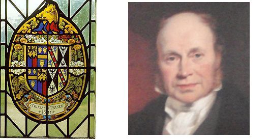 Thomas Willement and an heraldic glass panel designed by him
At the same time an even greater designer was rediscovering the vitality of early heraldry. Augustus Welby Pugin was a Gothic Revival enthusiast who made his reputation with the design of the decorative details at the new Houses of Parliament. They are alive with a riot of splendid arms, crowns, beasts and badges which drew their inspiration from the neighbouring Chapel of Henry VII in Westminster Abbey.
Stimulated by this new excellence, other artists emerged during the nineteenth century. Dom Anselm Baker, Forbes Nixon and Charles Sherborn all had their own distinctive styles and Graham Johnston breathed new life into the artwork at the Office of the Lord Lyon King of Arms in Scotland. The College of Arms, however, remained something of a stylistic backwater until George W. Eve arrived. He was born in 1855, the son of a competent heraldic miniaturist and began his career as a herald painter, working mainly for Charles Athill, Richmond Herald. But he found it restricting and narrow so struck out on his own, establishing his reputation with a series of etched bookplates, especially those for Windsor Castle and the invitation card for the Coronation of Edward VII. He was very versatile and designed for stained glass, seals, embroidery and enamelling and in 1892 published Decorative Heraldry, A Practical Handbook. It was followed in 1907 by Heraldry as Art and they both became influential source books for later artists. Among these was Gerald Cobb. He came to the college in 1920 and soon established himself as a herald painter of exceptional ability. Among his best known work is the series of designs for 128 shields and fourteen large achievements of the arms of eminent Englishmen produced for the 1939 New York World’s Fair. His work is notable for its fine draughtsmanship and sensitive line with a subtlety of colour unusual in heraldry. He was also an architectural historian and became an authority on the City of London churches and church furniture, an interest which preoccupied him in later life, although he kept his studio at the College until his death in 1986. For a time I had the studio next to his and remember with affection his readiness to advise and help. His influence can be seen in the work of his pupil, Henry Gray, who is still a leading herald painter. He came to the College in 1952 after winning a design competition in The Coat of Arms and worked for Anthony Wagner, then Richmond Herald. He painted the letters patent for The Heraldry Society and illuminated the margins with foliage enclosing the arms of the three Kings of Arms and the badges of the heralds and pursuivants which established a pattern for later decorated patents. His mature work includes many designs for corporate and personal seals and the exceptional bookplate of Sir Colin Cole, Garter.
Another outstanding artist of recent years was Norman Manwaring. He was the son of a distinguished calligrapher and began his career at the age of five although for many years he was an independent artist and only came to the college in 1960, the year in which Shield & Crest by Julian Franklyn was published with 443 illustrations in colour and black and white by Norman. They show the influence of both Gerald Cobb and Graham Johnston but he later developed his own flamboyant style with its distinctive drawing and intricate hatching. He died suddenly in 1985, shortly before another of the College’s artists, Geofrey Mussett, died in a road traffic accident.
He was the last of several generations of heraldic artists and a strong thread of eighteenth- and nineteenth-century influence ran through his work.
Two other fine artists are Fred Booth and his former pupil Dennis Field, who are both notable for the high technical quality of their work. One of Fred’s outstanding works is a roundel of the arms of Barclays Bank of California, elegantly designed in a circular composition. In contrast, the work of John Bainbridge has a richness and vitality that owes much to the Scottish tradition. The ornate patent of the Police Federation, granted in 1982, is typical of his work.
In recent years a number of talented younger artists has appeared on the scene and in this sophisticated commercial capital where the computer and word processor now hold sway it is encouraging to report that a new generation still work in the age old skills and traditions of herald painting.
A large part of that work is concerned with the painting of Letters Patent, or Grants of Arms as they are known. These pass through many stages from a client’s eligibility being established to the time when he proudly carries away with him the final impressive document rolled up in a smart scarlet box. The design stage begins with a consultation between the client and herald about the content of the arms. They must be heraldically correct, distinct from existing arms and preferably be aesthetically pleasing. They can be abstract in character or contain charges which allude to the client’s interests, career or ancestry. Unfortunately, the artist is rarely involved at this vital stage, which comes as a surprise to many people. The quality of the design depends largely on the artistic sensibility of the herald and his skill at guiding clients with a poor visual sense although, of course, the kings of arms do have the final word and can avert potential disasters.
The artist’s first contribution is to prepare a coloured sketch of the proposed design which is submitted to the client for approval and signature. It then goes to Garter for approval and if no alterations are required is returned to the artist accompanied by a blazon which gives an accurate description of the arms. He then begins painting the letters patent.
The full achievement is painted on the top left hand corner of a piece of vellum which is already headed with the arms of the Earl Marshal, the royal arms and those of the College of Arms. These can be printed in outline, hand painted and drawn from stock or they can be entirely hand-drawn and painted, at extra cost, of course.
My own method is to first make a drawing of the full achievement on tracing paper, beginning with the shield and working outwards to the rest of the achievement. The main problem I have to solve is to reconcile the shield, which is two dimensional, with the three dimensional elements, helm, crest, wreath and supporters, which should be imagined as being in the round. The success of this exercise is a measure of the calibre of an artist. The silhouette is probably the most important design feature. It should be dramatic and bold, with a good balance and proportions between the different parts. There are no rules about this, an aesthetically pleasing result is all that matters. The shape of the shield has changed over the centuries and the variety of their proportions and outlines gives the designer room to adapt. The fourteenth-century heater form is the best for most designs but some arms seem to suggest other types, an impaled or quarterly coat can fit better on a cusped and fluted Tudor shield with full base while others suggest a twelfth-century kite shape. Very few arms fit well into the unfortunate lozenge used by ladies although flexibility is allowed and the outline can be filled out or pinched in to accommodate unsympathetic charges.
In addition to variations of shape the design may also suggest variations in the tilt of the vertical axis of the shield. This is known as couché and is usually shown sloping to the left.
Whatever the form, charges should make use of the available space without being crowded or be so small that the effect is weakened. The drawing of the beasts and birds found in the natural world raises another problem for the artist. To what extent should they be stylised? The heraldic lion, for example, is a different beast from the
natural lion. He is the abstract expression of a lion’s attributes of nobility, power, strength, courage, vitality and ferocity. These qualities should animate the design. The flowing line down the spine and hindquarters should express this life and the massive shoulders and strong forelegs should give a sense of power; the unsheathed claws and open jaws express ferocity. The tail should spring from the loins and the hair from the tail with a similar spirit.
When drawing helmets the artist now has more freedom than in the past. The old rules about their position have, happily, been relaxed. Those of baronets and knights once looked to the front while esquires looked to the dexter and this led to some bizarre anachronisms; a lion crest might appear to be leaping off the side while the helm travelled forwards, a demi-eagle could peer at the viewer while his helm faced to the left. Both are now treated as a single unit and can be adjusted so that they are aligned. The base of the crest is encircled by a wreath. It should appear to be pressed down on the brow of the helm with the six separate twists of the cloth clearly showing. Flowing from beneath it is the mantling. The mantling is a vital element in the overall balance of the design and it is in its decorative handling that the skill of the designer is really seen; the strong twists and flourishes of the material can invigorate the design or weaken it if badly drawn.
The drawing of supporters faces the artist with one of his most difficult problems. Whatever their combination they somehow must be made to balance. They should not be so large that they dominate the shield or so small that they cannot see each other across the top of it. Ideally, they should be of equal weight and, of course, heraldic in character. This does not necessarily mean the traditional beasts and monsters, some of the most successful designs feature exotic birds or animals that were unknown in the middle ages. The real problems start with the often bizarre combinations of dissimilar creatures that are sometimes granted. Imagine having to balance a lion with a bee (for the Industrial Society) or a monkey and a basset hound (for Lord Black). Human figures are rarely successful as supporters, they lack the dramatic silhouette necessary for good heraldry, but they can work if clad in exotic garb, for example the two judges of the sixteenth and eighteenth centuries granted recently to Lord Denning. They can sometimes be rather comic, for instance the almost naked negro slave gazing across the shield at a scantily-clad lady in feathers and flounces granted in 1976 to the Borough Council of Kettering! Supporters can be shown standing on a compartment, or grassy mount, a decorative bracket, or left floating unhappily in mid-air. The compartment and motto-scroll should be conceived as a single unit and the twists and turns of the scroll designed to accommodate the words on it, they can be Roman or uncials and written with a brush or a pen. Coronets can add distinction to the arms of peers but the decorations and insignia which are included in many designs are rarely of much aesthetic value, they tend to confuse the eye and offer no scope for invention by the designer. Other accessories are badges, shown either beneath the arms or in the centre of the vellum, and the standard, a tapering flag displaying the arms, badge and crest. It can be striped and crossed diagonally by the motto and is usually shown on the patent flying over the crest.
When the drawing is finished it is fixed to the vellum with sticky tape and transferred using conté paper and a stylus or hard pencil. The next step is gilding. I always use gold powder. This is bought loose, usually by the gram, and is mixed with water and gum arabic as a binder. It is applied with a brush or pen in the same way as paint and is much simpler to use than the more elaborate method of applying gold leaf, although perhaps it does not have so much character. After polishing with an agate burnisher, at first through thin paper and then directly onto the gold, I add the colours using a sable-hair brush. The paints are a range of opaque water-colours called gouache and come ready prepared in tubes, although purists might wish to mix their own colours using traditional methods. Argent is left as blank and I start with gules, which tends to be translucent, and work through the medium tones, azure and vert, to sable, usually grey warmed with a spot of burnt sienna. I then add shading to suggest form, and outline to define the silhouette and lastly, highlights to bring the composition alive. After adding the motto the new coat of arms is complete.
Sometimes the grantee may wish to have a more elaborate patent. The initial ‘T’ which begins the text can be decorated, perhaps with a portrait of Garter King of Arms and the border illuminated with flowers, foliage, birds and beasts which might reflect his interests or be merely fanciful. I have recently painted seaweed curling among drops of oil for a North Sea Oil Company, pheasants among oak foliage for an unmarried lady in Dorset and planets set against a midnight sky background and linked by stars representing the Milky Way for the British Interplanetary Society.
The artist’s contribution is now complete and the grant is returned to the agent who, if satisfied, signs a form which is then passed to the Bursar who authorises payment for the artwork. The grant then passes on to a scrivener who writes the text which refers to the Memorial and the Warrant as well as describing the grantee and his new arms. Both text and illustration are then copied into the official registers of the College. The patent is then endorsed by the Registrar, signed and sealed by the kings of arms and finally, put into a scarlet box adorned with the royal cypher. While the letters patent are in the course of preparation, other artwork can be produced
Library Paintings are certified paintings on strained vellum. I have mentioned vellum before so maybe should say something about it. It is a natural material, made from calfskins or goatskins and is the material traditionally preferred by scribes and illuminators. Each skin is different in texture and weight so the preparation process must be tailored to suit each one, but basically the method is as follows: Fresh skins are soaked in a lime solution for ten to fifteen days to clean away salt and break down the fibres. Each skin is then individually passed through a machine with three large rollers, one of which is equipped with blunted knife blades, to scrape off the fur. After soaking in lime for another week, a skin is passed through a similar machine, with well-sharpened blades, to scrape off fat and flesh from the underside, then returned to the lime solution for a further two weeks. The cleaned skin is stretched on a wooden frame, using string attached to pegs, which can be turned to pull the skin taut. In fine weather it can dry naturally, but heat-drying is usually employed. To prepare the writing surface, a craftsman shaves each skin with a semi-circular blade, taking account of its individual thickness and any weak areas. This removes the grain and smoothes the surface, which is finally treated with pumice. For fine work vellum is given a light tone but it still retains its mottling, stains and the occasional bristle. These are, of course, part of its character and in no way blemishes. It remains sensitive to atmosphere and can absorb too much moisture or dry out if it is kept in
the wrong conditions. If it is left in sunlight or near a radiator for anytime it can be permanently damaged.
Generally, no further preparation is necessary but greasy patches can be treated with powdered pumice and porous areas dusted with gum sandarac. The library painting strainer is a piece of plywood or specially constructed frame which is sized, surfaced with a sheet of paper cut to size and then damped and glued to the edge of the board. A piece of vellum with an overlap of three inches is next damped on the back and stretched over the frame and the edges turned down and glued on the back of the board. As it dries, the paper and vellum tightens like a drum and creases and bubbles disappear leaving a flat, even surface on which the painting is prepared. It is a more elaborate version of the grant painting and signed by a herald to certify its accuracy.
These can, of course, be expensive and a certificate painting is sometimes preferred. This is a copy of the grant painting but on card which is then certified and signed in the same way as a library painting. Arms look attractive on letterheadings, envelopes or publicity material and full colour can look ostentatious so a black and white line drawing is used instead. This is a drawing of either the full achievement, or part of it, the shield only or perhaps crest and motto. I use black paint drawn on with a brush and a pair of compasses for the sides of shields and curves of the motto scroll. Any shading is kept very simple.
A finer treatment is required for designs to be engraved on silver. The artist has to imagine that his brush is a graving tool cutting into the metal so the lines are finer and form is suggested by delicate shading. Tinctures can be indicated by the direction of the lines, ‘The Petra Sancta’ system, but this tends to confuse the design and fortunately is less popular than in the past. It was also once much used in drawing book-plates which are still popular despite the fact that few people now have libraries. They are usually designed to fit a rectangular shape with the mantling extended to fill the corners and the words EX-LIBRIS at the top and the owners name at the base but there are many variations. Decorative edges of flowers or foliage can add variety.
Some of the earliest appearances of heraldry were on seals and they still remain a source of delight to artists for the opportunities for design that they give. The usual circular shape is ideal for a full achievement with the crest fitting into the top curve and the motto scroll in the base with the mantling being extended to fill the side panels.
In the fifteenth century supporters evolved from the fanciful creatures that filled this awkward space and they still remain a useful device for the artist to achieve balance and symmetry in a design. Holders of public office such as bishops or masters of colleges often use seals with impaled shields showing the arms of office on the dexter and their personal arms on the sinister. An inscription usually encircles the outer edge of the seal.
The design of flags is a specialised field but the herald painters are often called upon to depict them. The standard, a long, tapering flag originally for mustering supporters on the battlefield, is often shown on patents when a badge is being granted. Paintings of the banner, a square flag displaying the arms alone, are often prepared to guide flag-makers. When completed, they hang over the stalls of the Knights of the Garter at St. George’s Chapel, Windsor or the Knights of the Bath at Westminster Abbey. Others are for institutions, banks or colleges and some for private individuals.
Regimental colours are also designed and recorded at the College as are RAF and naval badges which are regulated by an Inspector who is at present a herald extraordinary. Less frequent commissions include designs for stained glass windows, coins, heraldic chess-sets, stone-carvings or embroidered panels and each requires a different approach and a familiarity with the working methods and techniques of craftsmen working in these very diverse media.
As I hope I have shown, the herald painter has to be a versatile and adaptable designer and a skilled draughtsman, able to interpret designs that are often difficult or aesthetically unsatisfactory and extract from them the maximum decorative and dynamic qualities and also be able to relate his material to its historical background. Our contribution to the College of Arms over the centuries has been of central importance but despite that we remain self-employed freelances who do not have the security of a contract or the financial benefits enjoyed by salaried employees. The demand for artists of suitable calibre continues, however. The apprentice system was the one by which most artists entered the College in the past but it has now virtually lapsed and at present we rely on talented amateurs appearing at the door with a portfolio of work to inject fresh blood into an old craft.